The previous WordPress theme used by this blog was replaced with a new one. The old one has not been updated for quite some time by the theme designer. And it has not been tested to be compatible with the most recent version of WordPress.
Your thoughts on the new theme?
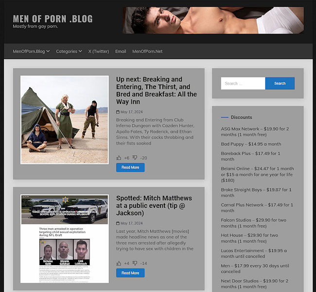
UPDATE 1
The main column is now the same size as the old one.
An option for light or dark mode was added at the top right part of the blog.


UPDATE 2
The light/dark mode option was removed.
I am now trying to re-design the new one to look like the old one, but in lighter shades of violet.
UPDATE 3
The light/dark mode option is back.


I’ve got to be honest…it is looking a bit spammy. A bit like when a dodgy link takes you to a site that your antivirus snaps into action on. Maybe it’s the colours, but I do think the original was pretty iconic.
I don’t like that the main column is so tiny. I’d prefer that the side columns had less emphasis.
This new theme is queer/bi/pan/fluid. The colour is obviously g4p and does vag sex so I don’t respect it. I never watch at it, but I’m still able to comment on it extensively.
Put down the bong. You’ve had enough for today.
hahahahah
So many statement colors! You’re right. This is (gay?) queer porn 2024! Definitely!
Doesn’t look good on an iPhone
IDK medical people keep telling us that blue light from the screen is bad for us and will keep us awake at night. Maybe less blue.
Yes, unfortunately that’s how it is. This is gay porn 2024!
What was wrong with the old one? This one looks cheap and messy. 🙁
I like it really much. So much better like the old one. The Design looks similiar like the popular Dracula-Theme.
I prefer the older, more linear layout.
The layout is good with Safari and chrome on an iMac. The header is messy on mobile. Light mode sure is bright, like a polar bear in a snow storm. I would try some different background shades to break-up the white. I’ll be using dark mode.
I’m a geezer. Change is bad.
I really did like that dark mode. It would be nice to get that option back again.
I like this new look. I was down with the dark look but I’m down with the light look too. Maybe you can alternate it where when it’s nighttime, it can revert to the dark look. Whatever you do, I’m all in with you!
I like it but liking/disliking is a bit of a chore for some reason and the font could be a bit bigger